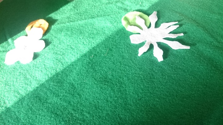
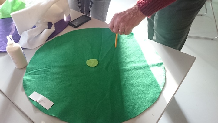
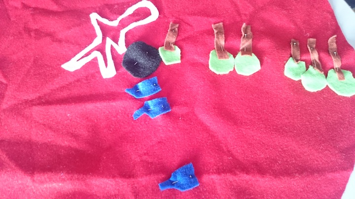
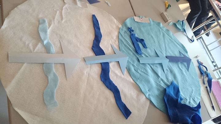
August’s workshop involved visualising the data we collected whilst doing the human sensor activities and creating felt data maps for each weather type that we can then add the predictions to. At the end of the next session we will have a felt data map to represent each weather type being used to understand current weather and then we will be able to sort which prediction goes with which weather type. These felt data maps will become artworks in themselves as well as a way to understand how we can allocate poetic and evocative narratives about the future to the data.
We also talked about how we can mark this process through the event planned to take place at the end of the exhibition in October. We talked about folklore, seasonal festivals and harvest festival. We also talked about how we can symbolise and ritualise complex and distant things like seasons, climate and weather that are hard to understand in our everyday lives – which then led to making the abstracted data felt maps.
Mild Weather Data Map
1 to 15 degrees C
Heatwave Weather Data Map
29 to 100 degrees C
Arctic, Freezing and Cold Weather Data Maps
-100 to -0 degrees C
Next session we will be adding warm and hot data maps and adding the predictions to the weather types